Part 5: Styling components
Learn how to style components using Tailwind, our recommended CSS framework.
Introduction
Now that we have explored some of the FastStore UI components, let's give our storefront a whole new look and feel. Gatsby provides different alternatives to style components. We can use plain CSS as we would do when styling a conventional HTML page, or we can use preprocessors such as CSS Modules and LESS. Gatsby and FastStore UI are also not limited to any CSS framework.
With so many possibilities, the main goal of this part of the tutorial is to present our recommended practices when styling your website and using CSS preprocessors and frameworks.
Before you start
In this tutorial, you'll use Tailwind CSS. Tailwind CSS is a utility-first CSS framework and our preferred choice for styling components and building custom user interfaces. Notice that Tailwind CSS is already installed in your project, and you can start using it straight away.
info
Both Gatsby and FastStore UI are not strict to any CSS framework. If you prefer, you can uninstall Tailwind CSS and pick any CSS framework of your preference, whether it's Emotion, Stitches, or even no CSS framework at all. But keep in mind that this guide covers only Tailwind patterns and best practices.
You'll use both inline styles and CSS Modules to implement Tailwind utility classes. We strongly recommend using inline styles whenever possible since this is less harmful to the website performance. CSS Modules will be used only to organize complex styles.
Configuring Tailwind colors and patterns
Tailwind allows you to define a custom design system. You can do that by setting up the tailwind.config.js file located at the root directory of your project. Open the tailwind.config.js file and add the following configurations to define a custom color palette and font family to your website.
const colors = require('tailwindcss/colors')

module.exports = {
  theme: {
    fontFamily: {
      sans: ['SFmono-Regular', 'sans-serif'],
    },
    extend: {
      colors: {
        primary: colors.red,
        secondary: '#FFF3F6',
        anotherCustomColor: '#FFC4DD',
      }
    }
  }
}
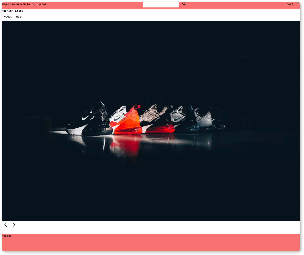
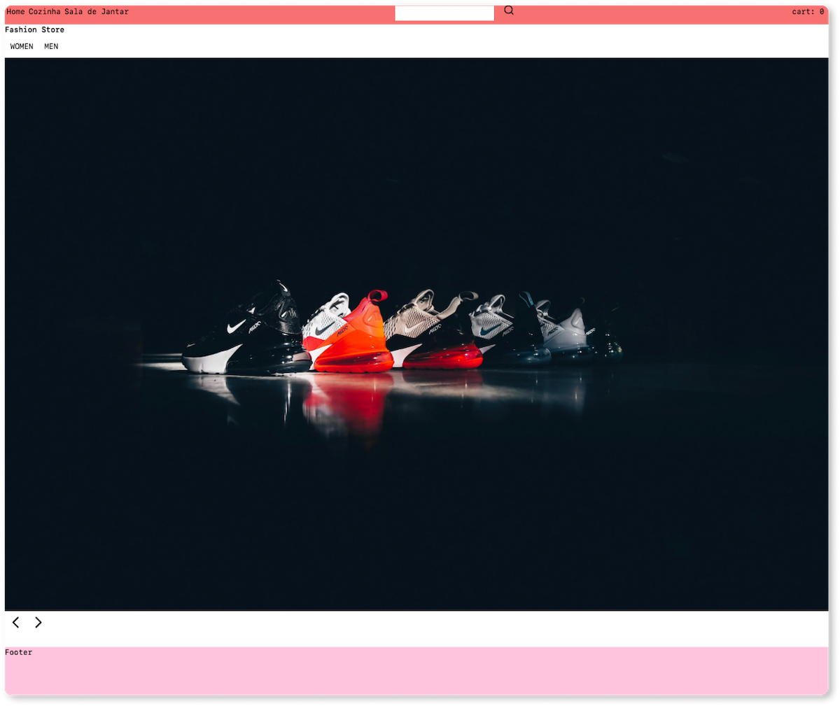
Start a development server (yarn develop) and switch to the browser window to check the new style of your storefront. You'll probably notice some changes in the typography and color of your NavBar and Footer. That's because these components are using the custom primary color.
Let's see this in action, open your Footer component:
import React from 'react'

function Footer() {
  return <footer className="w-full h-32 bg-primary-400">Footer</footer>
}

export default Footer
There it is! The bg-primary-400 class is setting the custom primary color as the background color of our Footer component.
Try changing this value to bg-anotherCustomColor and see what happens.
tip
When defining your design system, please check the Tailwind documentation on creating your configuration file. Also, be aware of the differences between overriding and extending a theme.
Adding global styles
Now that we have set up our design system, let's see how to style our website. Let's begin with the simpler option: global styles. This option applies the same styles to the entire website.
Global styles are set up in the src/styles/global.css file. For example, in our Base Store, Tailwind styles are being applied to our whole website elements and pages:
@tailwind base;
@tailwind components;
@tailwind utilities;
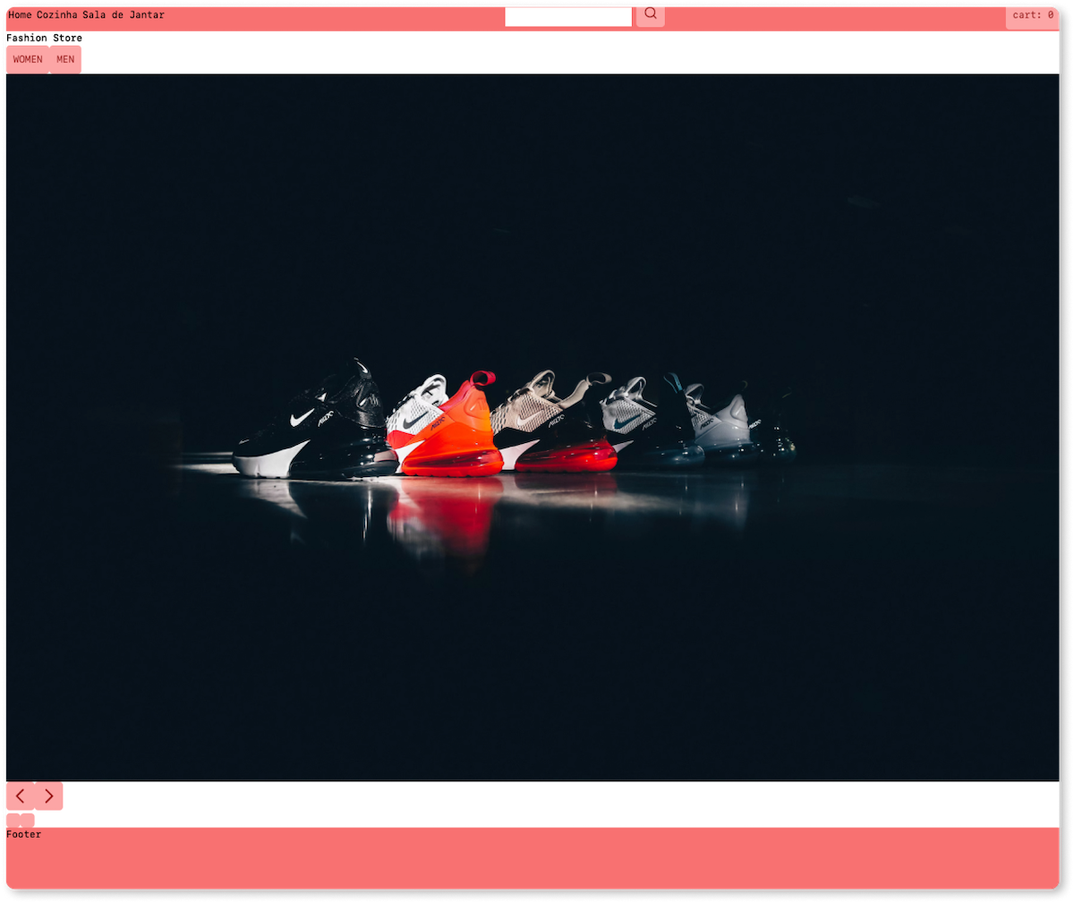
As an example, let's change all FastStore UI Buttons of our website by adding the following CSS style to the src/styles/global.css file:
@tailwind base;
@tailwind components;
@tailwind utilities;

[data-store-button]{
    @apply rounded-md bg-primary-300 text-primary-800;
}
note
Don't know from where data-store-button is coming? Check the reference documentation of the Button component.
If you followed the previous part of this tutorial, Part 4. Using FastStore UI components, you'll probably notice some changes in the Carousel and navigation buttons we added to our home page. Also, as you navigate the website, you'll notice that the global style that we just created is being applied to all elements on all pages of the website. Try visiting a product listing page and see what your website's buttons look like.
caution
Troubleshooting: If the global styles defined within the src/styles/global.css file are not being applied to your storefront, check if the src/styles/global.css file is being imported to /gatsby-browser.js. For more information, check the Gatsby documentation on Creating global styles.
Ok, that's probably not the best use for global styles 😅. That's why, in the following section, we'll learn how to create styles scoped to specific components and sections.
Styling components
WIP
This documentation is currently under development.